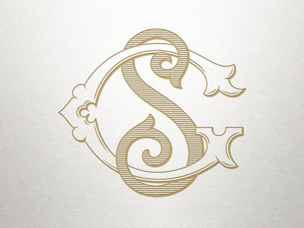
The concept of monogram: why a company needs a monogram
The concept of monogram is an essential element of the visual perception of a brand, which helps make it recognizable and unique. This approach is mostly used by representatives of the fashion industry, such as Louis Vuitton and Gucci.
The monogram is a distinctive sign of the company which is created as a result of a combination of several letters. Its main peculiarity is that two or more letters should be united as a whole, have common facets, and be a continuation of each other.
Monogram on a par with the logo plays an important role in brand recognition, but it is more visually appealing. There is a certain mystery here that the brain wants to untangle – to separate the letters, to understand how they connect. Such a combination can serve as an abbreviation for a complex name but made not just as an abbreviation, but with a twist. For example, an unusual representation of one of the letters, or the flow of one into the other.
Although it is possible to creatively design such a sign, a monogram will not become an independent differentiator for a company, especially if the brand is not well known. That said, it is convenient to use it to translate the name in cases where the full name would be inappropriate or would not fit into the layout. This form of writing is optional but can be a good alternative to a logo.

Developing a monogram consists of several steps. The first thing to start with is drafting a brief. In this case, the client shares his goals with the designer and sets certain tasks. Specialist cuts off those unnecessary and on the basis of the wishes and requirements draw up the overall goal of the project and its vision.
The second point is the choice of which two letters the monogram will consist of, although there may be more. Here, difficulties may arise with names consisting of several words. In this case, it is not necessary to use all capital letters, you can choose two or three. You should also pay attention to how the combination will sound.
Now you can proceed to the graphic design of the monogram, but it is better to start with a hand sketch. Gradually, the schematic drawing will acquire the necessary features, and then you can proceed to the computer processing.
The choice of color is an important step. After the design of the monogram reaches the final stage, you should think about the color scheme. It’s better to start with the traditional black and white tones, and then gradually select the ideal combination.
To assess the quality and the viability of the monogram, it is better to test its design in different versions – reduce, increase, complement, and transform. The sign should be legible and not overloaded with additional elements. Users should recognize common features with the company name or logo.


